Who wants to sift through an endless wall of text to get the required information? When communicating with a high volume of numeric data, your copy can easily fall victim to readers with short attention spans, especially the busy ones who tend to multitask. It is essential for your press release to contain meaningful data yet still be digestible and shareable.
The solution to this challenge? Infographics!
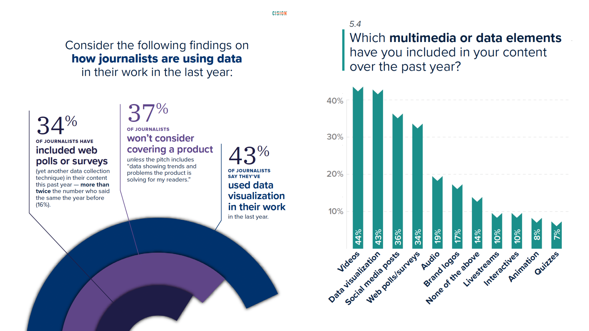
Derived from our 2023 State Of The Media Report
It is said that “a good infographic is worth a 1,000 words”, and the statistics do back this up! Our 2023 State of the Media Report found that journalists love to use infographics in their own works. 43% of them included data visualizations in their content over the past year, whilst 34% have used web polls or surveys as data collection techniques.
Our report also found that 37% of journalists won’t even consider covering a product unless a pitch includes "data showing the trends and problems" that the product solves. This further outlines the importance of incorporating meaningful data that speaks for your organization’s offer.
Here are some tips on enhancing your press releases with data visualization via infographics,
1. Use Impactful Data to Demonstrate Value

LILYSILK summarizes the most important achievements of their collaboration with One Tree Planted, highlighting the company’s ESG actions and adding a visual link to the topic of reforestation, in alignment with the release’s overarching theme.
Every piece of data that you feature should provide value to your readers and this example demonstrates this perfectly. The nine statistics in the image are the most impactful ones that impress upon the reader the positive influence of LILYSILK’s actions on society and the environment. By condensing the list of benefits to the most tangible examples for their audience, LILYSILK’s infographic ensures that every point counts.
The TLDR? If you want readers to understand the impactful nature of your organization’s achievements, be picky about which statistics you choose for your infographic and think about how they aid in driving your desired message across.
2. Keep Things Digestible
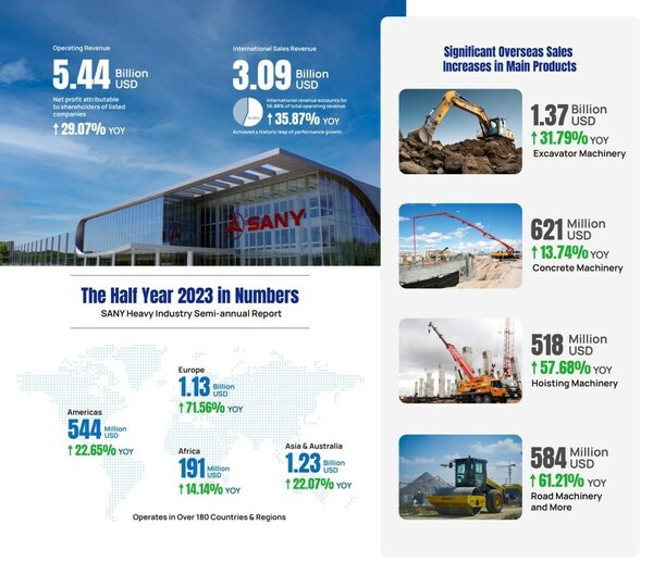
SANY followed our tips and used a handy infographic to summarize a large amount of information in one digestible infographic. Data condensed into an easy on the eye infographic increases the chances of internalization by readers as it is easier to digest than a lengthy written explanation of the figures.
When crafting a visualization of report numbers for your next release, follow SANY’s lead and leave clear space between each statistic to avoid overwhelming your readers with dense data blocks. By incorporating relevant imagery, such as the construction equipment featured in this example, you ensure that your visualization is easy-to-understand across all screen sizes when on display.
3. Incorporate Your Brand’s Design Elements
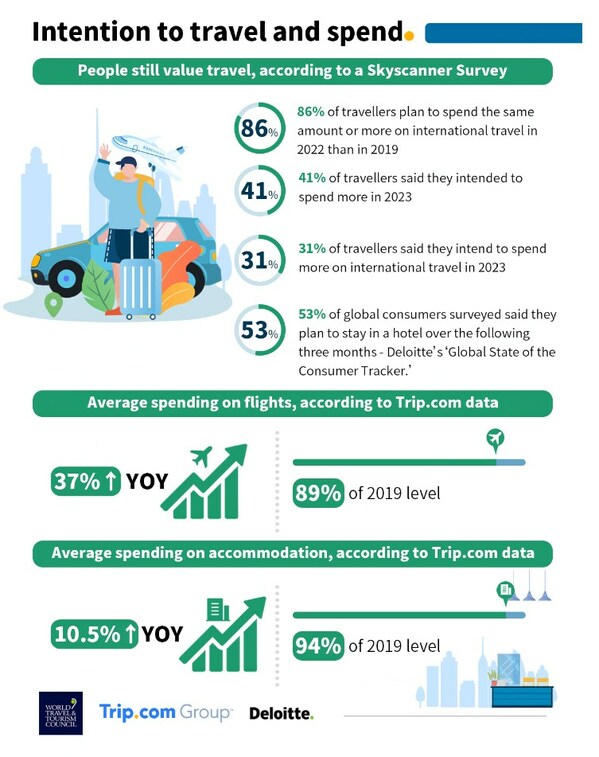
Trip.com Group’s release from the beginning of the year highlights the findings of an extensive survey about travel habits. The infographics featured in the release are consistent with Trip.com visual identity, incorporating the brand’s logo, typography, and corporate art style. In addition, the surveys highlight Trip.com Group’s position as a travel industry leader, communicating industry trends in a way that journalists love.
Incorporating your brand’s unique design elements in your infographic can help the audience draw a connection on all the shared information back to your brand! Some great ways to do this are through the usage of logos or a recognizable color scheme. And of course, you would want to focus on the positives so that your infographic carries an air of optimism!
Establishing a mental association between that valuable dose of well-researched visual information and your brand would enhance your organization’s status as a dependable and trustworthy data source.
4. Turn Your Infographic into a Story!

The World Heart Federation raises awareness of cardiovascular disease through a funny, but poignant cartoon strip. The tone of the comic aligns perfectly with the motivational narrative that the release seeks to communicate - The mobilization of people around the world to beat heart disease.
Did you know that cardiovascular disease is the leading cause of death? The chances of readers remembering this fact now would be higher after reading this impactful cartoon strip.
Bear in mind that your audience is also human! By making certain tweaks, simple statistics or data can be much more memorable for readers. Consider turning the information in your release into a story that will leave an impression on your readers. This example from the World Heart Federation enhances their press release as it is now more engaging and shareable with their infographic.
Conclusion
In a competitive media landscape, where you are trying to grab the attention of journalists and potential customers, the information-rich and shareable nature of an infographic can bring your press release to the next level.
In short, do
Use impactful data to demonstrate value
Keep things digestible
Incorporate your brand’s design elements
Turn your infographic into a story!
Remember that the goal when you incorporate a data visualization should be to elevate the shareability of your release through an attractively condensed nugget of valuable information. We hope these tips are helpful when you craft your infographics for your next release!
Speak to our trusty consultants today if you would like to find out some of the other ways we can elevate your communication campaigns.

About Stephen Erhorn
Stephen Erhorn is an editor at Cision, based in Beijing. He uses his communications and PR expertise to support clients in refining and distributing their press releases.